PrERT-CNM-v4
Phase 1-2 Progress and Accuracy Dashboard
Snapshot date: 2026-04-05
Purpose
Provide a visual and tabular status view of project progress and model quality indicators through completed Phase 1 and Phase 2 work.
Data Sources
artifacts/phase-1/controls_*.jsonlartifacts/phase-1/chunks_*.jsonlartifacts/phase-2/phase2_manifest.jsonartifacts/phase-2/baseline_scores.jsonl
Executive Summary
| Area | Metric | Current Value |
|---|---|---|
| Phase 1 | Total controls extracted | 237 |
| Phase 1 | Total chunks generated | 239 |
| Phase 1 | Chunk inflation vs controls | +0.84% |
| Phase 2 | Controls mapped to metrics | 237 / 237 (100%) |
| Phase 2 | Synthetic metric observations | 711 |
| Phase 2 | Public mapping validity (OPP-115) | 115 / 115 valid (100%) |
| Phase 2 | Baseline score rows | 723 |
Legend
- ↑ higher is better for output-value metrics
- ↓ lower is better for output-value metrics
- Risk-band distinction (Fig 4): low-risk improves when it increases, and high-risk improves when it decreases.
- If total scored rows change between runs, compare low/high percentages (shares), not only raw counts.
Figure Table
| Figure ID | Figure Preview | Key Takeaway |
|---|---|---|
| Fig 1 | 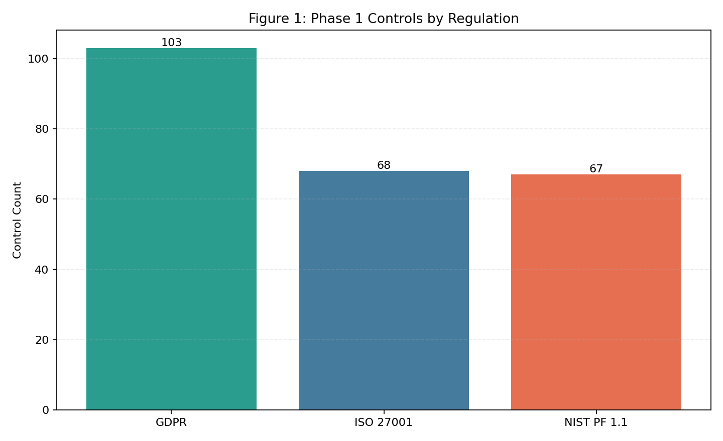 |
GDPR is the largest single control source (103), with ISO and NIST balanced (68/66). |
| Fig 2 | 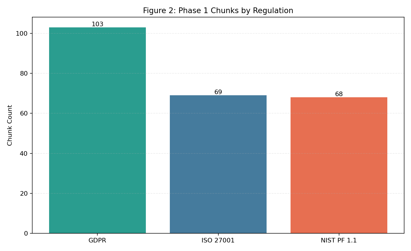 |
Chunk split closely matches control split, indicating stable chunking behavior. |
| Fig 3 | 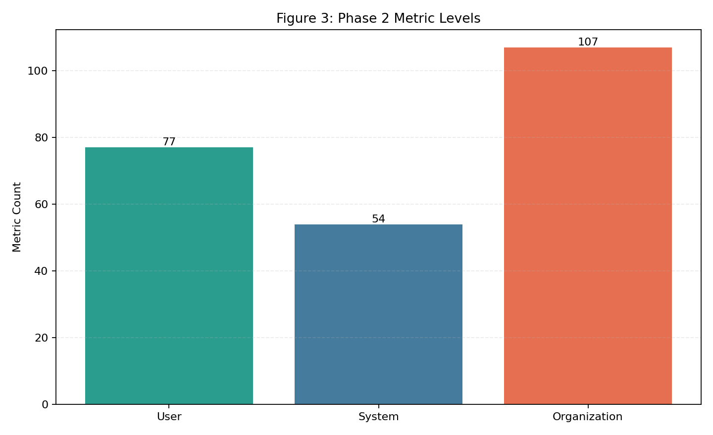 |
Organization-level metrics are the largest share (100), then user (82), then system (55). |
| Fig 4 | 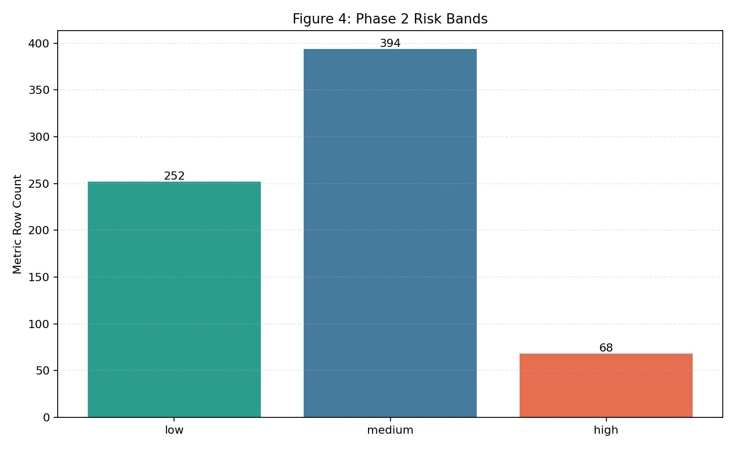 |
Most rows are medium risk at baseline (389), with 251 low and 71 high; low up/high down. |
Fig 1. Phase 1 Controls by Regulation
What this means:
- This chart shows how extracted controls are distributed across regulations.
- A balanced mix is useful for coverage confidence; extreme skew would indicate potential under-extraction in one source.
- Clear distinction: this is not a “higher is always better” or “lower is always better” chart.
- Better result definition: distribution remains aligned with intended source coverage and avoids unexplained skew.
- This is a context chart, not a direct better/worse score.
Fig 2. Phase 1 Chunks by Regulation
What this means:
- Chunk totals track how much searchable content was generated per regulation.
- The near alignment with control totals indicates chunking behavior is stable and not excessively fragmenting text.
- Clear distinction: total chunks being higher or lower is not inherently better by itself.
- Better result definition: chunk/control behavior stays stable over time (low drift, low inflation spikes, no sudden skew by source).
- This is a context chart; use it to detect parser/chunker drift over time.
Fig 3. Phase 2 Metric Distribution by Level
What this means:
- This chart shows where metric emphasis currently sits across user, system, and organization layers.
- Organization-heavy distribution indicates stronger governance/process representation relative to system instrumentation.
- Clear distinction: no single level being larger is universally better across all runs.
- Better result definition: the mix remains intentional and complete for the target operating model (no critical level underrepresented).
- This is a context chart used for coverage mix decisions, not a direct performance score.
Fig 4. Phase 2 Risk-Band Distribution (Metric Rows)
What this means:
- This chart shows the current risk profile from baseline metric rows.
- Desired trend over time: low risk count ↑ and high risk count ↓ as controls and scoring quality improve.
- Clear distinction: for this chart, low-risk and high-risk move in opposite “good” directions.
- Better result definition: low-risk share increases and high-risk share decreases; use shares when run sizes differ.
- Medium risk often represents transitional cases that should be reduced through better feature coverage and calibration.
Regeneration command:
python scripts/generate_phase12_dashboard_figures.py
Accuracy/Quality Indicator Tables
Notes:
- Phase 1-2 currently expose quality indicators (coverage, validity, and risk stability), not supervised classification accuracy against labeled held-out sets.
- This avoids overstating model performance before Phase 3/4 benchmark protocol is complete.
Table A. Coverage and Data Quality Indicators
| Indicator | Definition | Value |
|---|---|---|
| Metric coverage | mapped_controls / total_controls | 237 / 237 (100%) |
| Missing controls | controls with no metric mapping | 0 |
| OPP-115 mapped rows | public rows ingested into canonical schema | 115 |
| OPP-115 valid rows | rows passing required fields (event_date, sector, records_affected) |
115 / 115 (100%) |
Table B. Scenario Stability Indicators
| Scenario | Composite Compliance (↑) | Composite Risk (↓) | Risk Band |
|---|---|---|---|
| normal | 77.6% (0.776494) | 22.4% (0.223506) | low |
| stressed | 57.0% (0.569538) | 43.0% (0.430462) | medium |
| adversarial | 37.3% (0.373206) | 62.7% (0.626794) | medium |
Table C. Average Metric-Level Scores by Scenario
| Scenario | Mean Confidence-Adjusted Score (↑) | Mean Risk Score (↓) |
|---|---|---|
| normal | 77.6% (0.7757) | 22.4% (0.2243) |
| stressed | 57.0% (0.5703) | 43% (0.4297) |
| adversarial | 37.3% (0.3705) | 62.7% (0.6295) |
Interpretation:
- Risk increases monotonically from normal to stressed to adversarial.
- This trend is expected and indicates scoring sensitivity to scenario severity.
Next Measurement Targets
- Add held-out policy-clause classification accuracy (Phase 3).
- Add calibration and uncertainty reporting (Phase 4).
- Track trend lines across runs by appending this dashboard with dated snapshots.
Navigation
| ⬅ Back | Next ⮕ |